Designing for
Human Logic.
Hey, I'm Rahul. Product designer with 5+ years owning the work end to end. From early research and product framing to shipped UI. I've led design across mobile, web, AI, and enterprise platforms, where the users are under pressure and the stakes are real. I bring systems thinking, deep research, and accessibility by default. Also a stand-up comedian on the side.
 Microsoft
 Byteridge
 Optimal Strategix
 Terre des Hommes
Case Studies
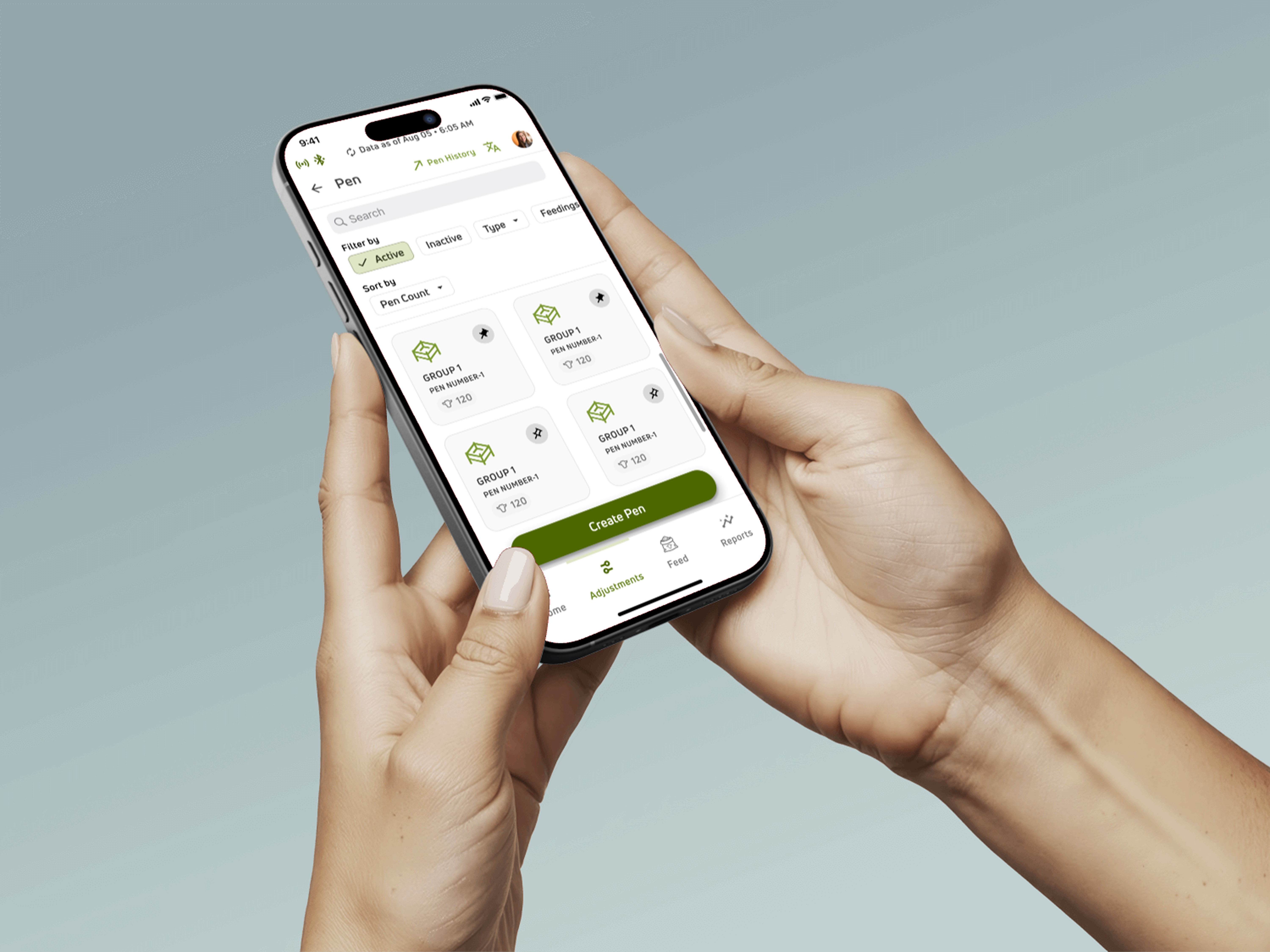
Sole designer on a mission-critical iOS app for large-scale dairy farms. The users weren't tech-savvy, the conditions were brutal (4am starts, low connectivity, gloved hands), and a single wrong tap could mean real animal welfare consequences. Every screen had to earn its place.
The Problem
Dairy farms lacked any unified system to manage feed operations. Workflows were fragmented, which led to feeding errors, inaccurate cost tracking, and wasted resources. Non-tech-savvy Spanish-speaking feeders worked in high-pressure, early-morning environments where a single wrong input could have direct animal welfare and financial consequences.
My Role
Sole UX/UI Designer with full end-to-end ownership. I led user and persona research, defined the information architecture, designed every interaction flow, built wireframes through to high-fidelity UI, and shipped the interactive prototype in close partnership with the client's product and engineering teams.
Who I Designed For
Farm Owners: need cost visibility and efficiency reports. Feeders: time-critical daily tasks, often in gloves, outdoors, 4am starts. Nutritionists: define and monitor recipes. The feeder persona was the hardest to design for. It was also the most important.
Design Psychology at the Core
Recognition over Recall: feeders shouldn't have to remember system states. Error Prevention over Error Recovery: in a farm environment, a mistake caught before it happens is infinitely more valuable than a graceful error message after the fact.
Separated viewing and editing states for all critical entities. Error prevention over micro-efficiency, backed by research showing low-literacy users are more likely to trigger destructive actions via accidental taps.
Leaned heavily into icon-led UI, grounded in psycholinguistic research on reading load under time stress. Under pressure, users revert to visual pattern recognition. Every icon validated with real users before it shipped.
Connectivity indicators, sync status, and background operation progress persist across every screen. When you're offline on a farm and don't know it, you make decisions on stale data. Visibility of system state is trust infrastructure.
Research on motor accuracy in fatigued users shows significant degradation in fine-motor control. Feeders start at 4am. We designed for the tired, gloved, outdoor version of the user. Not the ideal one at a desk.
Across four very different domain concepts (pens, ingredients, feedings, reports), I held the navigation structure identical. Hick's Law in practice: reduce decision load by making the next step always predictable.
Outcome & Impact
Shipped a single iOS app that replaced multiple fragmented workflows. Feed errors dropped measurably during mixing and distribution. Feeders reported strong confidence in time-critical tasks for the first time. Farm owners gained real-time cost visibility they never had before. The product is now the daily backbone of feed operations on every farm using it.
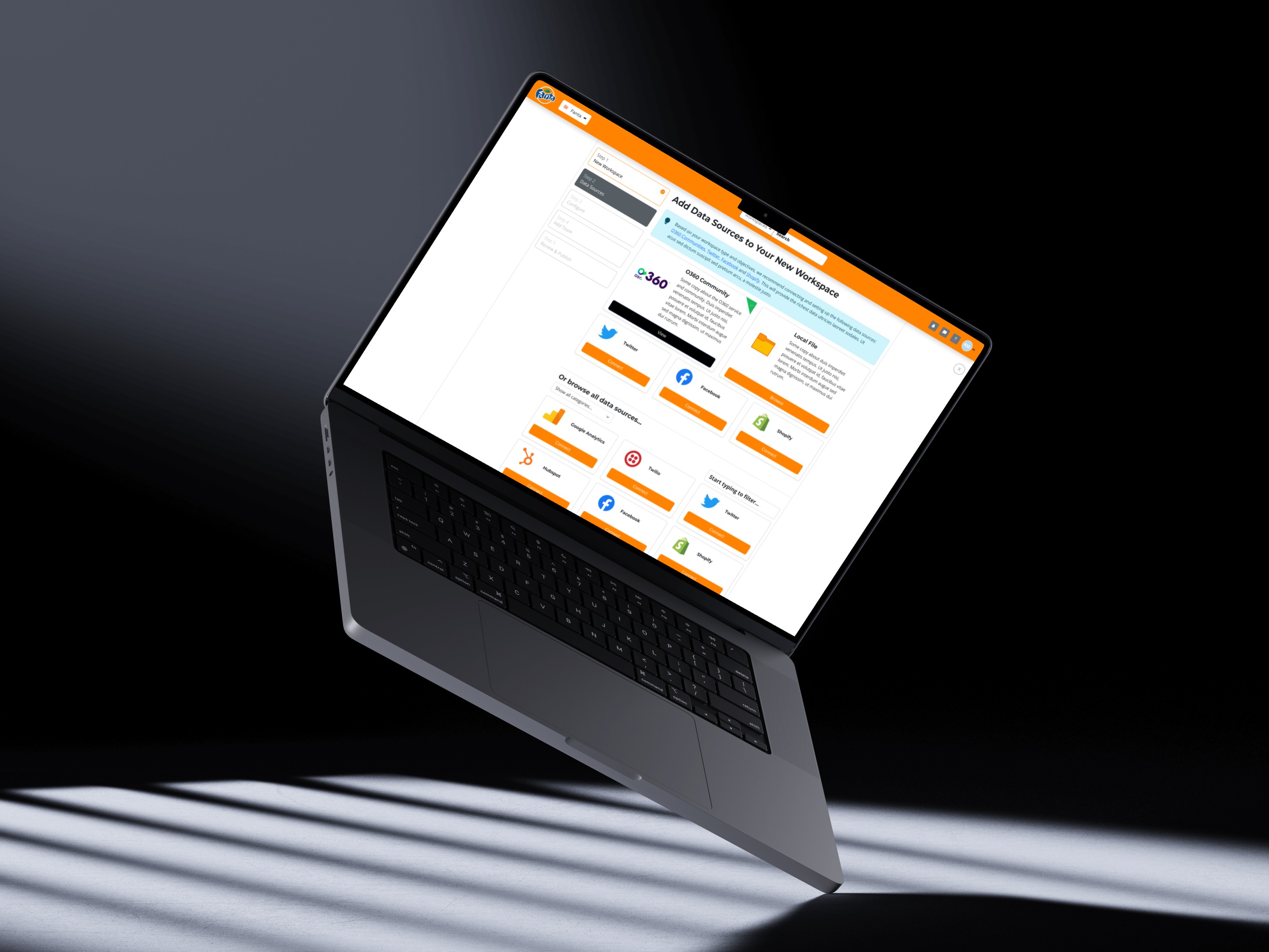
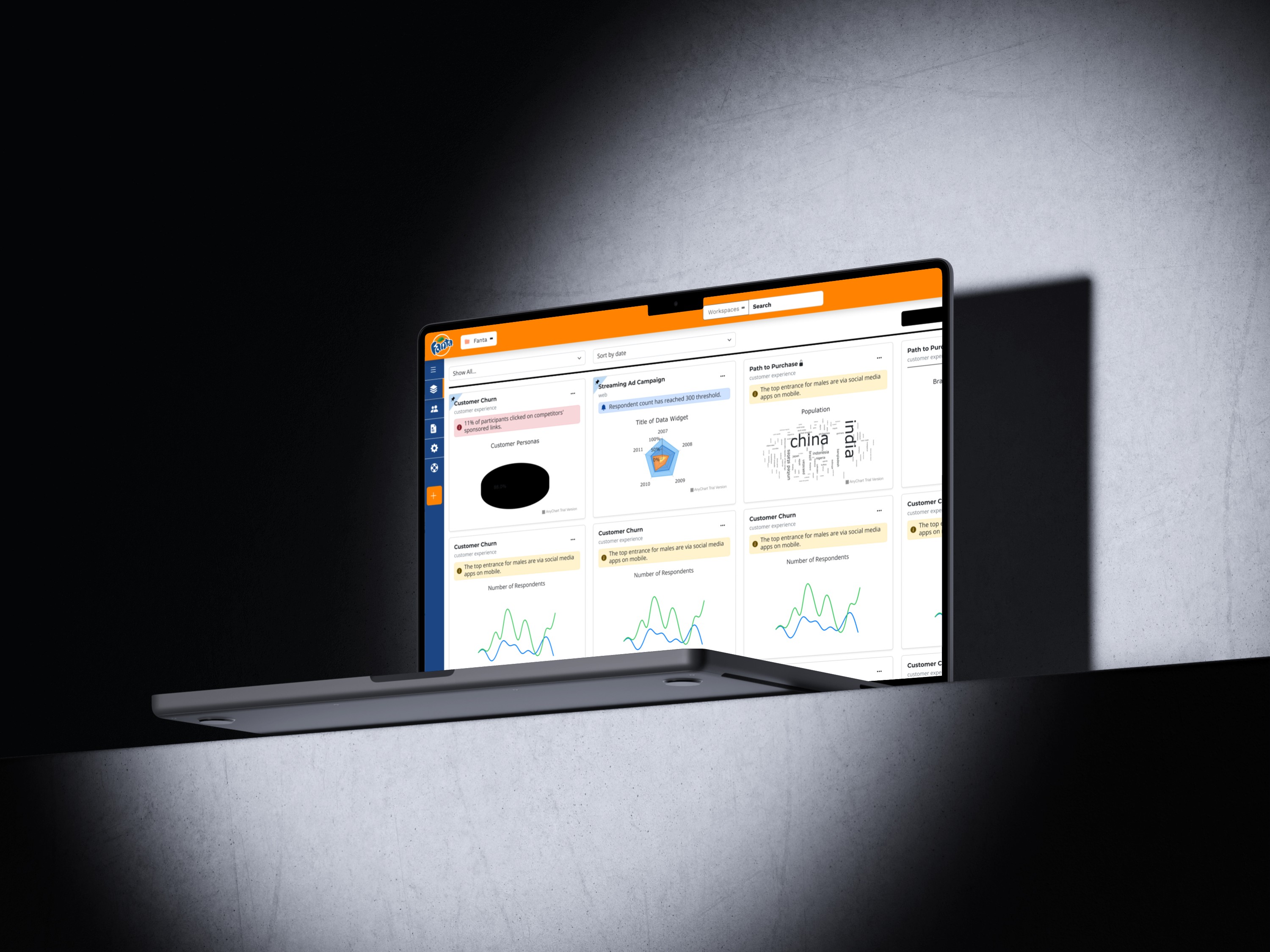
A two-year enterprise engagement with Optimal Strategix Group. The job: take fragmented data scattered across multiple brands and unify it into one workspace that works for both marketing managers and data analysts. Two very different users, one product, no compromises.
The Problem
A parent company managing multiple brands had no unified view of their data. Teams switched between disconnected tools and manually stitched together reports. The problem wasn't a lack of data. It was the lack of a coherent system to navigate it.
My Role
Lead UX Designer across a two-year engagement. End-to-end design, from user research and persona development through information architecture, interaction design, wireframes, and a full high-fidelity prototype.
The Design Challenge
Sarah (Marketing Manager): works fast, switches brands constantly, needs visual clarity. John (Data Analyst): needs control, depth, and precision. Build for the analyst and you lose the marketer. Simplify for the marketer and you frustrate the analyst. The job was to build for both without compromise.
Research Insight That Changed Everything
In a key interview, Sarah told me she wasn't struggling to find the data. She was struggling to trust it. That single sentence shifted our framing from “show more data” to “make data feel reliable and navigable.” Clarity became the design value, not volume.
Designed around progressive disclosure, the surface is simple enough for Sarah, but depth is always one intentional step away for John. Miller's Law and cognitive load theory applied as architecture, not just a UI pattern.
Folder and workspace navigation spatially consistent, same position, same behaviour, every time. Grounded in spatial memory research: when UI elements move unpredictably, users lose confidence in the system itself.
Pushed the product team to invest in automated trend highlighting, surfacing significant data shifts proactively. Reduce the cognitive effort users must spend just to understand what they're looking at before they can act.
Designed report editing directly inside the dashboard view. Every context switch carries cognitive overhead. Keeping users in flow dramatically lowers the effort-to-insight ratio.
Consistent navigation, consistent card structures, consistent interaction behaviours. On an enterprise product these aren't aesthetic choices, they're the difference between a tool that scales gracefully and one that becomes UX debt.
Outcome & Impact
Marketers and analysts now work in the same product without one slowing the other down. Users analyse data faster, switch between brands without losing context, edit and publish reports inline, and connect multiple data sources through a single interface. The framework I designed is the foundation OSG continues to build on.
Images coming
soon
A ground-up redesign of a financial services company's core debt collection platform. The old interface was fragmented and overloaded. The new one is structured around how collectors actually work, not how the system was originally architected.
The Problem
The platform was breaking under scale. The interface had no clear hierarchy, navigation was driven by system logic rather than user workflows, and collectors had no efficient way to search, filter, or act on large datasets. The platform tried to show everything at once without guiding users on what mattered most.
My Role
Sole Product Designer with end-to-end ownership. I went beyond UI to shape product direction. I identified systemic gaps through stakeholder discussions and heuristic analysis, redefined the information architecture, and designed a scalable experience framework from the ground up.
Who I Designed For
Debt Collectors: high-volume, time-pressured users who need fast access to debtor information, friction-free bulk actions, and views they can customise around daily priorities. Every design decision was validated against their real workflows.
The Reframe
Before touching a single screen, I reframed the problem. This wasn't a UI issue. It was a lack of product structure and prioritisation. The challenge became: how do you design a system that reduces cognitive overload while enabling users to operate at scale with speed and clarity?
Replaced fragmented navigation with a structured side-nav system. Reduced dependency on dropdown-heavy interactions and created a clear separation between global and contextual actions. Impact: reduced navigation friction and improved task discoverability.
Instead of overloading one screen, introduced pivot tabs to segment data logically, letting users focus on one dataset at a time. Grounded in cognitive load theory: reducing the number of active decisions a user must make at any moment.
Designed a robust search experience with filters and advanced queries so collectors could narrow large datasets quickly. In debt collection, finding the right record fast isn't a convenience, it's operational currency.
Introduced multi-select for bulk operations and contextual action menus per row. Collectors work at scale, a system that forces one action at a time is a system that doesn't respect how the work actually happens.
Modular dashboard with widgets users can add, remove, and reorder. Collapsible sections to surface priority data. This was the biggest product shift, moving from a static system to one that adapts to each user's context.
Minimised unnecessary iconography, introduced text-supported actions, and built visual hierarchy across data and actions. Density without hierarchy isn't information, it's noise. Readability is a performance feature.
Moved forms into focused modal flows with clear primary and secondary actions. Eliminated surrounding clutter so users could complete tasks without losing context. Impact: improved task completion and measurably reduced errors.
Outcome & Impact
Faster task completion through streamlined workflows. Significantly less time spent navigating and searching. The platform now scales gracefully under growing datasets, with a modular architecture built for future expansion. The biggest shift: the product moved from system-logic-first to user-workflow-first. That's what made it usable at scale.
Part engineer.
Part comedian.
Full-time designer.
I came up wiring circuits in engineering school. Now I'm obsessed with something messier: how people make sense of systems. One day I'm designing for a dairy farm worker logging feed at 4am. The next it's an analyst drowning in five dashboards. Or a team of debt collectors fighting through a tool that's working against them.
I don't just push pixels. I shape product direction. I ask why the thing needs to exist, who's going to use it under pressure, and what falls apart when it scales. I take work from research, IA, and product framing through to shipped UI, and I defend the decisions that make it scale. That's the actual work.
Download CV- User Experience Designer IIByteridge · IndiaMay 2023–Present
- Product Designer II (Contract)Microsoft Corporation · via ByteridgeSep 2024–Dec 2025
- User Experience DesignerOptimal Strategix Consulting · IndiaAug 2021–May 2023
- User Experience DesignerTerre des Hommes Netherlands · IndiaSep 2020–Aug 2021
- BE Electronics & InstrumentationRamaiah Institute of Technology · Bengaluru
- Psychology of Design & UX StrategyGrowth School
- Foundations of UX DesignGoogle
How I Think
⚠ Fine Print: Process may involve excessive caffeine and the occasional pun during Sprint Planning.
I don't design from assumptions. Every project starts by understanding real people in real context. Their goals, their frustrations, and the gap between the two.
01If something feels hard to understand, that's a design failure. Every moment of confusion is a signal: a gap between what a system does and what a person expects.
02Accessibility isn't a final checklist. It's a constraint I work with from the first sketch. Designing for the edges always improves the experience for everyone.
03The best design lives in the world and gets better with real feedback. A prototype that ships to real users always beats a perfect one stuck in Figma.
04Design doesn't happen in isolation. I work closely with product and engineering, building shared understanding rather than tossing designs over the wall.
05Error states, empty states, edge cases. None of it is afterthought work. This is where trust gets built or broken. I care about the full experience, not just the happy path.
06My Stack
Primary design environment. Components, auto-layout, variables, prototypes, team libraries.
Photoshop, Illustrator, After Effects, visuals, brand work, motion design.
Component architecture and pixel-perfect layouts for Sketch-ecosystem clients.
Research synthesis, design decisions, and project docs shared cross-functionally.
Sprint alignment, task tracking, design-to-dev handoff across product cycles.
Research acceleration, copy refinement, rapid design direction validation.
Workflow automation, connecting research tools, survey pipelines, notifications.
Front-end fluency to prototype in the browser and communicate precisely with engineering.
Let's build
something great.
Product design, UX research, and design systems crafted with intent. I work with forward-thinking teams that care about craft. Let's build something meaningful.